Monday, December 16, 2013

Quantile Versus Natural Breaks


The above map depicts changing the way the data is broken up can change how a map ends up looking. Due to where I made the natural breaks on the second map, there ending up not being a stark difference. However there are a few states here and there that move from one data break to another (such as Hawaii, Maine, and Oklahoma).

Wednesday, December 11, 2013

Final Project Map

After a lot of back and forth, below is my final map. Unlike the previous draft map I posted, this map specifically looks at which states have the most active brewer permits, and where the top ten craft breweries are located. The states on the high end of the spectrum for active brewer permits also tend to host one or more of the top craft breweries. 

I decided to change the data of my map because I felt that using beer consumption per cpaita would be a bit misleading (per capita meant it would be skewed by states with higher densities). The choropleth data was divided up using natural breaks, given the huge extremes from 2 brewer permits to 332 brewer permits. 

After having so much fun collecting the data and creating this map, I think my next endeavor will be creating a map looking at how much each state's beer industry has grown or not grown (because amazingly enough, there is data for that). 

Monday, December 9, 2013

Extra Credit Option #2

This semester in digital cartography has produced some pretty awesome maps. Below is my ranking of the maps that really stood out.


  1.                                                        This map was chosen because of its unity of theme (farm land) throughout the entirety of the map. From the background, to the proportional symbol choice, typeface, and even the north arrow used. This map screams farms. 
  2.                                                        The radiating background initially draws the eye in, but what really caught my eye about Cory's map was the data and where he decided to distribute his dots. 
  3.                                                        Particularly striking about this map is the title's underline and how Nicole created a pattern to incorporate with the legend border. 
  4.                                                          A fun map utilizing cartoon heads of the 2012 presidential candidates. 
  5.                                                       This map screams Irish, from the "Proud to be Irish" icon to the green background. The maps's elements give it a very fun feel. 
  6.                                                                                    This map is pretty neat due to it's projection and the cartographer's use of negative space to really force the data into the forefront. 
  7.                                                        I love this dot density map. It has the feel of a surging hurricane. 
  8.                                                        A map showing Ptolmey's perspective of the known world at his time (1451-1500)
  9.                                                       Jared's color map find was certainly interesting. The cartographer's use of warm colors in the south and cooler colors in the north it kind of striking. 
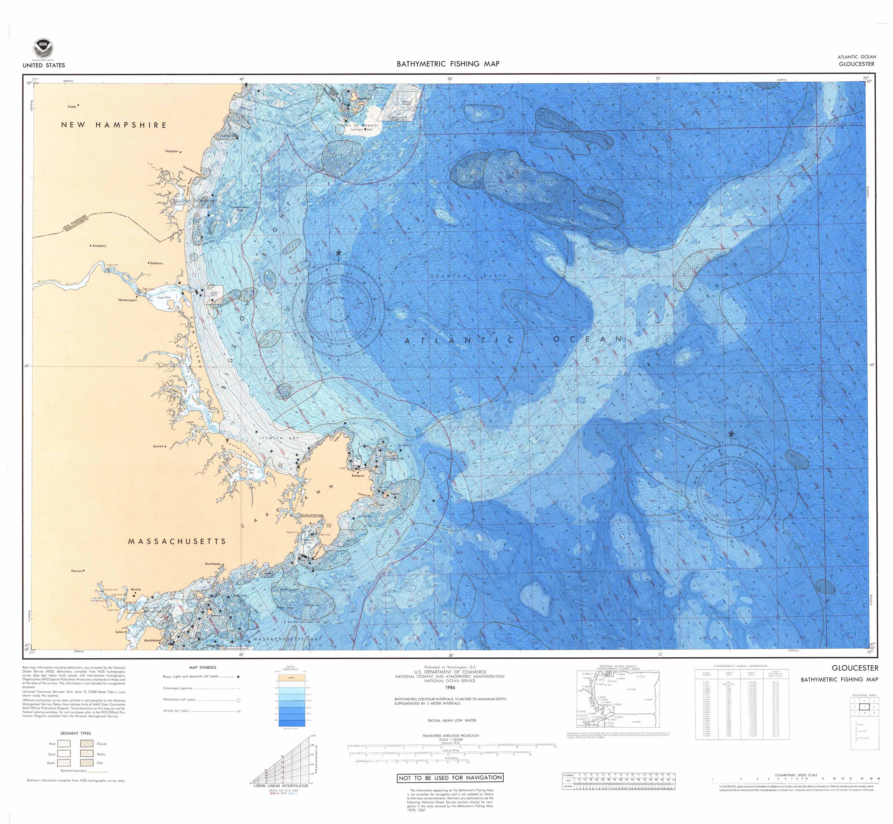
  10.                                                          Bathymeteric maps always prove interesting because maps of the ocean are usually outranked by maps depicting the land. 

The Trouble with Trimbles

Let's talk about making maps with Trimbles, which is this cool gadget:


Not these little furry guys:


So what exactly is a Trimble? In simple terms, it's a mobile GPS unit for data collection in the field. Points, lines, polygons, this GPS bad-boy can do it all. That said, what is the trouble with Trimbles? Two words: satellite reception. If the unit has not established at least 3 satellite connections, you're going to have a bad time. Have no fear though! Like all technology there are usually some tips and tricks to make your Trimble cooperate:

  1. Speak to the Trimble softly. Yelling at it out of frustration will get you nowhere. Seriously though, be gently with the Trimble.                                    
  2. If the Trimble is not collecting data (such as a linear feature you're trying to record), pop a squat and chill for a little bit. It probably lost satellite reception and is working really hard to establish more satellite connections, because the Trimble really, really wants to help you in your data collection endeavors. 
  3. When you're tired of waiting, turn the Trimble unit off and on. Sometimes the Trimble forgets how to be a Trimble and it needs a little restart. 

When your Trimble is happy and decides to work, it can help you collect the data to produce some neat maps, such this one a few classmates and I created for our Field Mapping Techniques course:


Saturday, December 7, 2013

Work in Progress Preview

Here's an image of my unfinished map. Still debating the choropleth color ramp, with lighter yellow representing a low beer consumption (gallons) per capita, and the reddish orange representing high beer consumption per capita. The proportional circle will represent the number of active brewers licenses by state. I might end up inverting the data sets again, since it is still a work in progress.


Racism in America Based on Tweets (Courtesy of Buzzfeed, once again)

The following web address (copy and paste into your search bar) leads to a short video detailing a project mapping geo-tagged racist and homophobic tweets. The researchers are using heat maps to get a spatial appreciation of the occurrences of these hateful tweets.

 http://www.buzzfeed.com/nowthisnews/what-is-the-most-racist-region-of-the-usa-749g


19th Century Ship Voyages Outlining the Continents


The above map was found while following a twitter account called amazing maps. It's a pretty rad map on account of giving the viewer a sense how much exploring was going on in the 19th century. High-five to the explorers of that period of time!

More maps

 Below are a couple of my maps from earlier on in the semester. The first one was a typography and labeling exercise, and the second is just a black and white boundaries map of Maryland, Virginia, and Washington D.C.

On the MD, VA, DC map I was playing with using negative space.

Meandering River Map: Color Usage in Cartography


Rivers are incredibly dynamic and powerful feature that greatly influence their surrounding landscapes. From the Colorado Canyon carving deeper down into the Grand Canyon, to the ever meandering Mississippi River, it is easy to forget how these features influence the landscape over hundreds of years.

The above map is of the ancient paths of the Mississippi River, and through the colors and forms drawn, the cartographer tells an incredibly dynamic tale of how this famed river has meandered over time.

At first the red classifications boldly capture the viewers eye, introducing us to the dynamism of the Mississippi River. But notice, red is the only bold color choice and is broken up by the more subdued yellows, oranges, and blues. After the red curves so fearlessly dare us to gaze upon this image, those oranges, yellows, and blues begin to tell a deeper story of the Mississippi River's wandering path. Finally, after allowing the eyes to inspect each curiously colorful elongated curve, the center of the map reveals where this adventurous river had settled at the time the cartographer crafted this map.

Typographic Map (courtesy of Buzzfeed)

Below is a link to an article entirely comprised of type: 
http://www.buzzfeed.com/somenorcalguy/typographic-map-of-the-world-e6x

Saturday, November 23, 2013

Let's Talk About Projections

The following link is a youtube clip from a 90's show called the West Wing: http://www.youtube.com/watch?v=vVX-PrBRtTY 

In the 4:00 minute clip in which the Organizations of Cartographers for Social Equality lobbies to have the show's president (President Barlett) encourage legislation to support elementary and secondary geography education using the Gall-Peters projections.

Wait a second, there is more than one map of the world?? Heck yes there is, because depending upon the location/country/city being mapped and the scale used, the projection changes. For example, the lambert conformal conic projection rocks for depicting the United States:

http://myweb.unomaha.edu/~kstuart/CartGIS/MapProjection/USALambertsConformalConic.png

http://www.geoatlas.com/en/maps/world-maps-0/mercator-projection-24

The above map uses a Mercator projection, and I'm willing to bet this is the projection the average American is most familiar with. Wait a second... is Russia really that big? Why does Greenland look bigger than South America? What the heck is going on? Without out getting into serious geography nerd jargon, the simple answer is that the further from the equator a landmass happens to be, the more distorted it's size and area will be.

Below is an image of the Gall-Peters projection: 
http://theirondandelion.files.wordpress.com/2013/08/gall-peters-projection-world-map.jpg

If you're used to the Mercator or even Robinson projection, the Gall-Peters projection probably comes off as a little trippy. "Like whoa, Afrca is HUGE, and Europe looks so small!". Now bear in mind, no world scale map is going to be 100% accurate. Ever. Where the Mercator projection was created predominately for the purpose of maritime navigation, the Gall-Peters is a cylindrical equal area projection. Wait a second, let me translate that into English: this kind of map is designed to depict each landmass based upon it's actual area. Hence why Greenland looks smaller than South America.

Map projections is one of those geography topics that could be discussed forever and eternity. However, it's a Saturday night, so let me leave you all with something more entertaining: http://www.youtube.com/watch?v=esbS_vT25GU

US Choropleth Map


The above map is an choropleth from earlier on in the semester. I went with the light blue to dark purple color ramp to represent the sequence of owner occupied housing data. Perhaps with the end of the semester around the corner I will be able to create a bivariate map of the number of owner occupied houses versus the number of rented houses per state (as both data sets were available to me at the time).

Thursday, November 21, 2013

Dot Density Example


The above map is the U.S. Census Bureau's 1980 population dot density map, or what also appears to be their "night time map" due to the fact it looks like the night time illumination one would expect to see with highly developed/urban areas. This map strikes a nice balance in that there is clearly a clustering, almost whiting out, of highly dense areas, but due to the smaller dot size there is not a vast white out effect being produced.

Isoline Map example


Isolines rock at depicting continuous data. From temperature maps on your local news station, to topographic maps, isolines are your friend in showing continuous data over a spatial plane. The above map forgoes the isoline boundaries, and instead the cartographer made the choice to simply allow the colors to flow from the low values to high values. It is important to note that the above map does not have set intervals for labeling it's isoline values, and since this is a temperature map for non-research purposes this is not terribly surprising -- most temperature maps produced at this scale are labeling temperature at the rough location of major cities (New York City, Washington D.C., Denver, CO, etc).

Bivariate Map example


The above map is an example of a bivariate map, utilizing proportional symbols with a chloropleth underlay. While the data choices are certainly interesting, the map's design deserves some consideration as well. Nicaragua is pushed forward by it's neighboring, grayed out countries, while it itself colorfully standouts with it's yellows, oranges, and blues. Particularly clever of the cartographer is the use of complementary colors (blue and orange) to help both data sets really stand out.

Typhoon Maps


Mapping storm systems is an interesting task that leaves the cartographer with a variety of questions. How much detail does the base map need? How should the storm trajectory be mapped? Should multiple potential storm trajectories be shown, or an extending buffer?

          The reason I chose these two maps in particular is because both find different ways to depict the storm path. The first map simply shows the storm path as a dotted line, with typhoon category bench marks as the storm passes over the Philippines, crosses the South China Sea, makes land fall in Vietnam, and proceeds north the China. On the other hand, the second map chooses to use color and symbol to depict the typhoon's intensity, and the storm trajectory is depicted as an expanding buffer, to underline the reality that the storm could shift course. The second map at depicts estimated times of the typhoon's position, which is also important information  in helping stage potential evacuations that may need to occur for coastal populations.

Wednesday, November 20, 2013

Bivariate Map


The above map was created using 2010 U.S. Census data, and I chose to represent data concerning the population density of each county in North Carolina, as well as what percentage of each county's population has a bachelors degree or higher. I was initially curious to use those data sets because I wanted to see how population density correlates with higher level of education.

Tuesday, November 12, 2013

Dot Density Map


The above map depicts the population density and rough distribution of persons under the age of 18 (also referred to as minors). Each dot represents 400 individuals, with a total of 1,005 dots for the entire map.

Thursday, November 7, 2013

Final Map Proposal


Map

Area of Interest: The United States of America

Tpoic: The number of breweries and beer consumed by state. 

Plan: To make a bivariate a chloropleth of the number of breweries per state, and overlay that with a proportional symbol of beer consumption per capita (perhaps beer steins, perhaps kegs).

Data: The wonderful thing about beer is that there's a plethora of data available (such as the brewer's almanac), and data is available for at least the past decade. 

Data resources include:
http://www.beerinstitute.org/assets/uploads/2012_Beer_Consumption_By_State.pdf
http://www.beerinstitute.org/br
http://www.brewersassociation.org/pages/business-tools/craft-brewing-statistics/breweries-per-capita

Audience: Aimed to be utilized by casual beer drinkers and beer enthusiasts alike. 

Thursday, October 31, 2013

Isoline Lab


This map is a fictitious isoline display of "smerg" levels in the state of Virginia by part per million concentration. Isoline boundaries were determined by a manual interpolation method, and thus the boundaries are not exact.

Tuesday, September 10, 2013

GGS 310 Blog Post 2 - Projections


source:http://www.esri.com/news/arcnews/summer03articles/introducing-arcglobe.html

This map is a particularly unique map created by Buckminster Fuller, designed to represent the Earth's various biomes. What's pretty neat about Dymaxion projection is that it can be folded up into a globe-like shape.

GGS 310 Lab 1 Assignment


Thursday, August 29, 2013

GGS 310 First Post


In recent years, America seems to have developed a growing thirst for microbreweries, and I was curious if any maps existed that reflected the growing market for microbrews. What I did find were a few projects that sought out to create interactive maps of where breweries could be found. The above picture is a screenshot taken from http://www.brewerymap.com/. This interactive map has features for finding breweries based on zip code, specific breweries, and even planning road trips!