Mapping storm systems is an interesting task that leaves the cartographer with a variety of questions. How much detail does the base map need? How should the storm trajectory be mapped? Should multiple potential storm trajectories be shown, or an extending buffer?
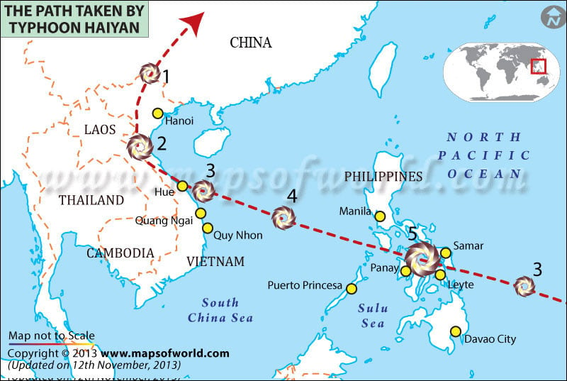
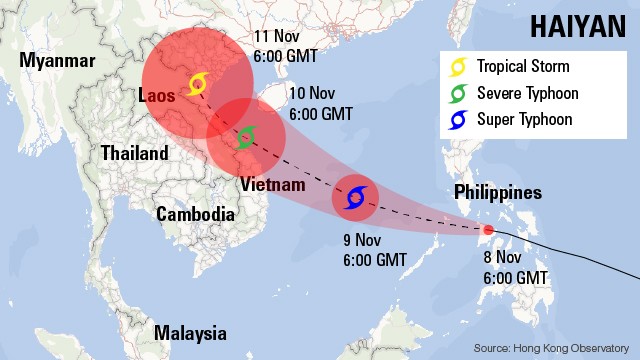
The reason I chose these two maps in particular is because both find different ways to depict the storm path. The first map simply shows the storm path as a dotted line, with typhoon category bench marks as the storm passes over the Philippines, crosses the South China Sea, makes land fall in Vietnam, and proceeds north the China. On the other hand, the second map chooses to use color and symbol to depict the typhoon's intensity, and the storm trajectory is depicted as an expanding buffer, to underline the reality that the storm could shift course. The second map at depicts estimated times of the typhoon's position, which is also important information in helping stage potential evacuations that may need to occur for coastal populations.
No comments:
Post a Comment