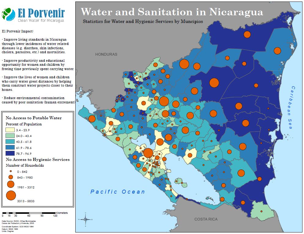
The above map is an example of a bivariate map, utilizing proportional symbols with a chloropleth underlay. While the data choices are certainly interesting, the map's design deserves some consideration as well. Nicaragua is pushed forward by it's neighboring, grayed out countries, while it itself colorfully standouts with it's yellows, oranges, and blues. Particularly clever of the cartographer is the use of complementary colors (blue and orange) to help both data sets really stand out.
No comments:
Post a Comment