Let's talk about making maps with Trimbles, which is this cool gadget:

Not these little furry guys:
So what exactly is a Trimble? In simple terms, it's a mobile GPS unit for data collection in the field. Points, lines, polygons, this GPS bad-boy can do it all. That said, what is the trouble with Trimbles? Two words: satellite reception. If the unit has not established at least 3 satellite connections, you're going to have a bad time. Have no fear though! Like all technology there are usually some tips and tricks to make your Trimble cooperate:
- Speak to the Trimble softly. Yelling at it out of frustration will get you nowhere. Seriously though, be gently with the Trimble.
- If the Trimble is not collecting data (such as a linear feature you're trying to record), pop a squat and chill for a little bit. It probably lost satellite reception and is working really hard to establish more satellite connections, because the Trimble really, really wants to help you in your data collection endeavors.
- When you're tired of waiting, turn the Trimble unit off and on. Sometimes the Trimble forgets how to be a Trimble and it needs a little restart.
When your Trimble is happy and decides to work, it can help you collect the data to produce some neat maps, such this one a few classmates and I created for our Field Mapping Techniques course:


 This map was chosen because of its unity of theme (farm land) throughout the entirety of the map. From the background, to the proportional symbol choice, typeface, and even the north arrow used. This map screams farms.
  The radiating background initially draws the eye in, but what really caught my eye about Cory's map was the data and where he decided to distribute his dots.
  Particularly striking about this map is the title's underline and how Nicole created a pattern to incorporate with the legend border.
  A fun map utilizing cartoon heads of the 2012 presidential candidates.
  This map screams Irish, from the "Proud to be Irish" icon to the green background. The maps's elements give it a very fun feel.
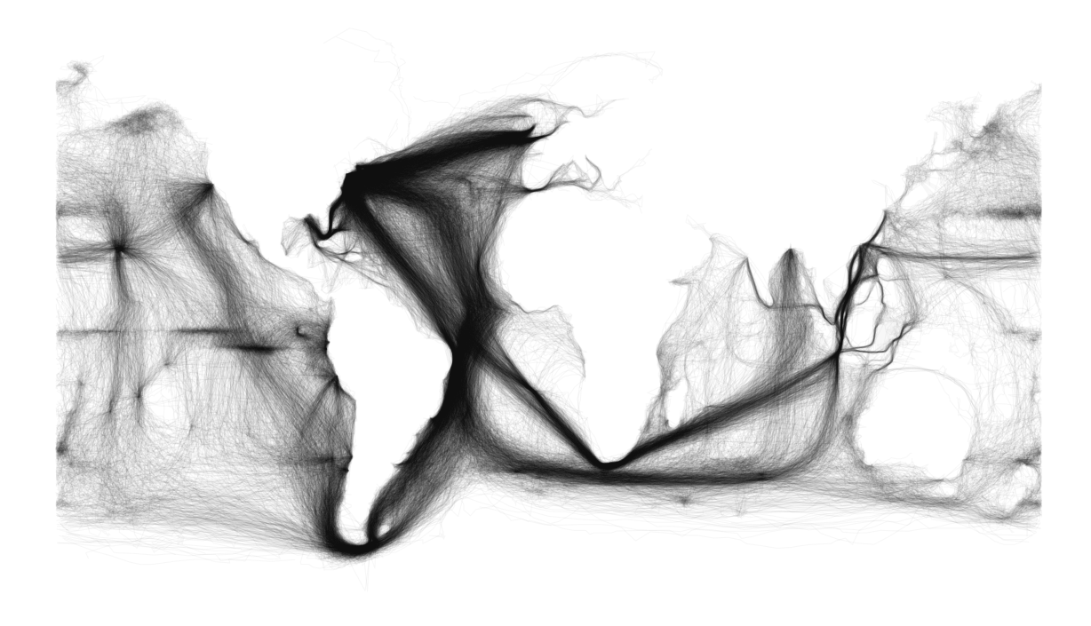
  This map is pretty neat due to it's projection and the cartographer's use of negative space to really force the data into the forefront.
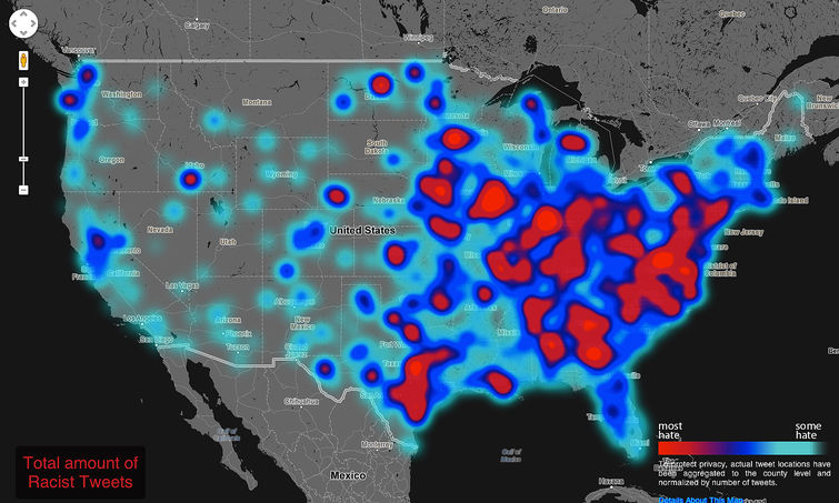
  I love this dot density map. It has the feel of a surging hurricane.
  A map showing Ptolmey's perspective of the known world at his time (1451-1500)
 Jared's color map find was certainly interesting. The cartographer's use of warm colors in the south and cooler colors in the north it kind of striking.
 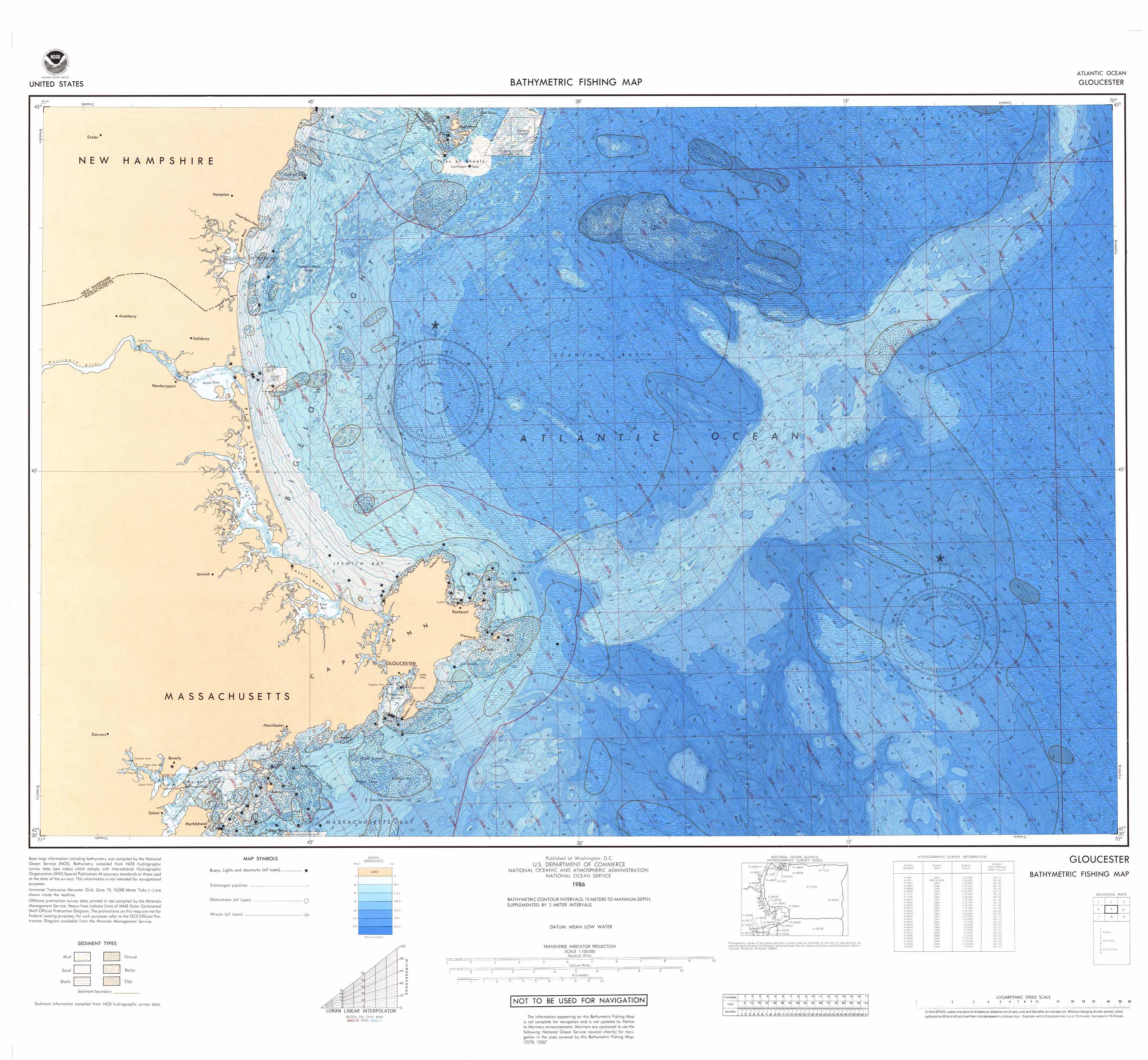 Bathymeteric maps always prove interesting because maps of the ocean are usually outranked by maps depicting the land.